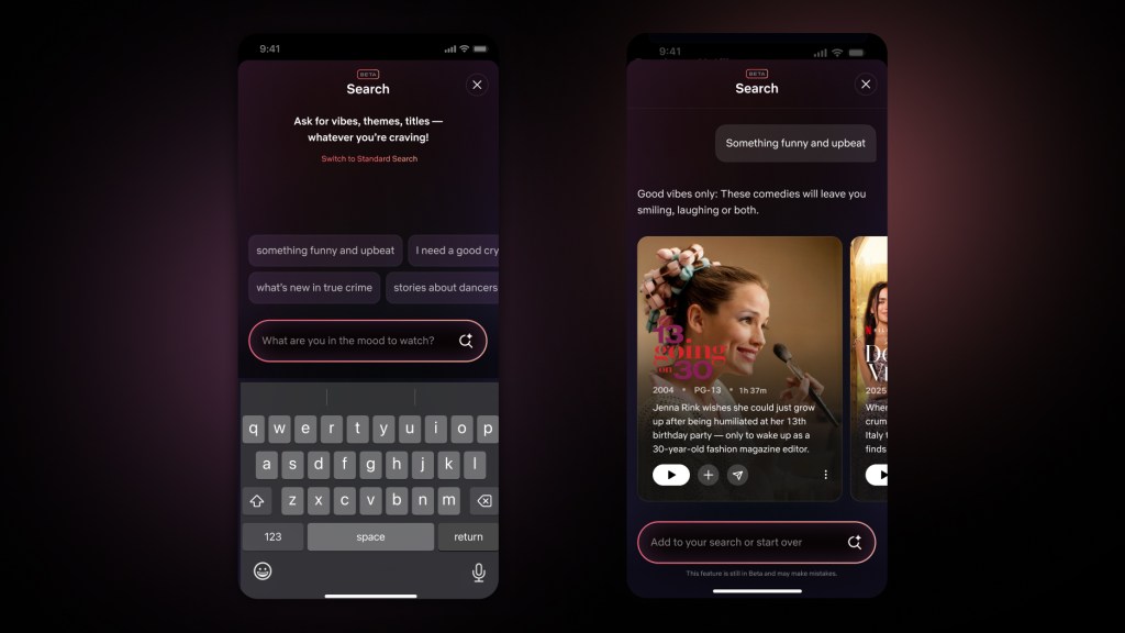
Netflix has overhauled its user interface, including a beta version of its search function that adds generative AI tools.
A prevailing objective of the revamp is more seamlessly delivering programming recommendations for subscribers.
Chief Product Officer Eunice Kim and Chief Technology Officer Elizabeth Stone detailed the updates during a virtual presentation.
Kim described the new Netflix look as “still the one you know and love – just better.”
One highlight of the revamp is an increase in information attached to individual titles, with identifiers like “Emmy Award winner” or “No. 1 in TV Shows.”
The AI search tools, which are initially only on iOS in beta, will also accommodate more conversational inquiries from viewers, like a request for “a scary movie – but not too scary” or “I want something that’s funny and upbeat.”
The streaming giant is also planning to test a vertical feed on its mobile app, enabling subscribers to tap to watch an entire show or movie immediately, add it to a personalized list, or share with others.
“Obviously, everything starts with great shows and movies that people love,” Stone said. “But if you think about all of the areas where Netflix has a big advantage — our reach, our recommendations, our fandom — tech enables all those things.”
The mobile experience is also getting more visible shortcuts, with “Search” and “My List” ,moving to the top of the page from the left-hand side, where they were “somewhat hidden,” Netflix said in a blog post.
Recommendations on the home page are now “more responsive to your moods and interests in the moment,” the blog post said, with an “elevated design.” Colors in the background of a show tile, for example, match the key art.

